6.27.2010

The Sexy-Rexy Rose

When I saw a friend's photographs of a public rose garden recently, I zeroed in on one particular variety that immediately caught my eye. Its lush and luxuriant appearance is what attracted me. I asked Gordon what they were called and he announced the name proudly: Sexy Rexy! (They are also sold in nurseries as Heckenzauber or Macrexy roses.) He also told me they are intoxicatingly fragrant, which further sold me on their virtues. If I had a rose garden, these would be growing in profusion. Below is some information about this amazing rose.

This is Gordon's photograph of the Sexy-Rexy, which he took at the Thornden Park Rose Garden in Syracuse, New York.

Sexy Rexy is a floribunda rose producing showy, heavy heads of camellia-like, rounded, fully double, rose-pink flowers with abundant glossy, dark green leaves. It is categorized as a perennial shrub and grows to about 3 feet in height. They are hardy between zones 5 and 9 and bloom from mid-spring to mid-fall, allowing for a long period of enjoyment. Like most roses, the petals are edible and have a mild, delicately bittersweet flavour, and they prefer full sun. The soil can be sandy or clay loam with pH levels ranging between 4.5 to 8.

6.25.2010

Projects of a Different Stripe

There's something about the crisp, clean look of stripes that brings an air of freshness and calm to a space, and often a touch of nautical adventure. Playing with the colours, widths and lengths of stripes can change a space even further. Below are examples of projects that use stripes to enhance spaces, indoors and out.
STRIPED SHELVES: It's stripes on stripes: Paint shelves with chalkboard paint in a color different from the wall for a linear look. These shelves have chalk-drawn lines along the edges. Displaying white items emphasizes the graphic effect. Learn how to make chalkboard paint.
STRIPED PENDANT LAMPS: A pair of white-and-blue pendant lamps brighten this eclectic kitchen -- with its 19th-century farmhouse table and retro-style chairs -- in more ways than one. Wrapping cotton cord around aluminum shades gives them a softer look, while the silvery interiors maintain their industrial edge. Lamp how-to, click here.
STRIPED ROPE BASKETS: Like magic, humble cotton cord meant for Venetian blinds becomes a basket with natural appeal and chic style. All you need is a little time and some glue. Wind the cord (Venetian blind cord, by Librett Durables, jamaliagarden.com) around a plastic flowerpot, gluing as you go and changing cord colors to make stripes. Use the baskets for bread, fruit, or potted plants, or create a set of desk accessories.
STRIPED TAGS: Plain tags from an office-supply store become bright and cheerful with the addition of stripes. Just wrap the tags with lengths of washi tape, a kind of Japanese masking tape (often sold in packs with several colors). The speedy, goof-proof process makes this a great project to do with kids.
STRIPED DESK ACCESSORIES: Buy decorative accessories or even office supplies in two colors, and -- voila! -- instant stripes. Here, we alternated storage boxes and envelopes for a graphic look.
STRIPED PILLOWS: Nautical stripes in faded blue combine with neutrals and naturals for a room that's modern and inviting. The daybed's large pillows began as throw rugs that cost $3 each (really!) and were stitched into shape with a carpet needle.
RIBBON-STRIPED SHEER CURTAINS: Inexpensive and ubiquitous, store-bought sheers will save you precious time and money by serving as the canvas for your creative additions. Turn organza ribbon into soft stripes on cotton-voile sheers.
STRIPED TABLE: Set the table for a whole season of festive cookouts by giving it a new summer coat. The wooden slats of a classic picnic table provide a ready-made outline for stripes. Table how-to, click here.
PAINTED STRIPE FLOOR: Painting a floor can give form to a room where everything is function, offset the formality of a living room, and restore life to a tired stairway. It is a bit of trompe l'oeil underfoot -- a visual pun that plays to an entire room. Floor how-to, click here.

6.22.2010

Martha's Pet Products at PetSmart

For someone who does not have a pet, I'm ridiculously excited about the new Martha Stewart Pets line at Pet Smart. I grew up with pets (cats, dogs, fish, lizards...) so I understand very well the desire to pamper and love them every minute they are with us. Martha's products seem to be designed to do just that. They are set at a slightly higher price point and have the pet's health and happiness in mind. Below are some of the highlights from the line. To see the whole collection, click here. (You all know I'm a sucker for packaging, and these designs do not disappoint!)
These are indoor, quilted waste pads, perfect for small dogs in apartments. They can be trained to go on the mat to do their business on those occasions when taking them outdoors is not an option.

Continuing on the "waste" theme, these boxes of eight waste-bag rolls in bright shades make clean-up easy on those long walks with Fido down sunny streets and pretty parks.

Are these dog-food scoops not so adorable? They have the measurement on the handle.
The ultimate in pooch grooming, this carry-all bag has it all: brushes, shampoos, clippers, everything you need to keep your companion tidy, healthy and happy. Love the colour scheme!
I really like the functionality of this feeding station with removable stainless-steel bowls for easy cleaning. The bowls also have lids to keep things tidy. It's all dishwasher safe, too!
Martha's customer will, of course, occasionally bake her own doggie treats. These dog-bone cookie cutters make the creation stylish and fully appropriate.
Crocheted squeaky toys? Of course! It's Martha.

6.21.2010

Martha Stewart Living: U.K. Version This Fall

Martha Stewart Living magazine will launch a U.K. edition of the publication beginning this September, according to Minonline.com. It is expected that the magazine will publish monthly and will have different content than the U.S. version of the magazine. The licensing partner is Pizzazz Media Ltd. which will also issue the U.K. version of Martha Stewart Living in Australia and New Zealand.

As the magazine approaches its 20th anniversary, the company is ramping up its international distribution of its flagship and supporting magazines. In July and October, respectively, Martha Stewart Living Omnimedia will release Everyday Food and Martha Stewart Weddings in Dubai written in Arabic. These will also be issued in Lebanon, Egypt, Saudi Arabia, Kuwait and Syria. Martha Stewart Living will be released in Indonesia this August, adding to the existing international versions of the magazine in Poland, Korea and Thailand. (International editions of Martha Stewart Living had previously been issued in Japan, Israel and the Philippines. The U.S. version of the magazine is currently distributed in dozens of nations around the globe.)

6.20.2010

Review: Josh's Bucolic Plague

Is it possible to become delerious with ruralistic pursuits of ideal farm life? Can overwork, stress and a driving desire to sustain a centuries-old mansion in a recession be cured by homemade cheese, handmade soap and a bevy of loving goats? Can the fragrance of Martha Stewart's peonies intoxicate a person and cause him to lose all good judgment, sensibility and bladder control? The answers to these questions lie in the pages of Josh Kilmer Purcell's hilarious and surprisingly honest memoir called "The Bucolic Plague: How Two Manhattanites Became Gentlemen Farmers."

Josh is someone I consider to be a friend, even though I've only met him once at his glorious farm/mansion in Sharon Springs, New York: the Beekman, as it's known locally. His partner, Dr. Brent Ridge, is also someone I call a friend, though to this day we have not met in person. Our paths crossed in 2008 after I saw Brent on The Martha Stewart Show making soap with Martha using milk from the goats on his farm. At the time, Brent was the senior vice president of healthy living at Martha Stewart Living Omnimedia and wrote a monthly column for the magazine. Always eager to blog, I wasted no time investigating their Beekman 1802 brand of handmade soaps and housewares and ordered a batch for myself - several batches in fact. The pair were so thankful for the free publicity (which I'm told brought much-needed traffic and sales to the Beekman) that they embraced me with open arms. We're friends to this day and I can't wait to return to Sharon Springs for another visit. (Hopefully celebrity and fame haven't gone to their heads too much, now that they have a hit reality show on Planet Green: The Fabulous Beekman Boys.) But back to the book...
My copy arrived a couple weeks ago, courtesy of Josh, and it coincided with the arrival of their "After the Garden" soap at the Anthropologie store where I work. I wasted little time using the beautiful soap wrapping as a bookmark, gluing it onto cardstock for firmness. I brought the book with me on my trip to Ottawa and I devoured it over the course of two days.

My first impression was how honest the book was, charting the good, the bad and the ugly sides of this dreamy pursuit of country living, which in reality is nothing like it is portrayed in the magazines. Josh examines the stresses and strains of starting a new business, maintaining a healthy relationship and building a dream as a couple, all the while attempting to enjoy the journey, the beautiful setting and the new community. His writing style is conversational and witty, making it easy to fall in love with the story being told.

Fans of Martha will not be disappointed either. She looms large in their lives (both idealistically and realistically) and Josh pens several very funny anecdotes about his encounters with Martha over the years, including a Fourth of July dinner at Lily Pond Lane and her famous Peony Party at Bedford - probably the most memorable Martha Moment the book contains!

What the reader is left with is a sense of admiration for these fabulous Beekman boys: for trying so hard to make a dream come true, for not slitting their wrists or killing each other in the face of desperate times and for letting an historic town, battered by a propeller of insufferable economies over the decades, capture their hearts and harness their determination to make their mark. You can order the book here.

Happy Father's Day

I'm not sure how many dads read my blog, but in case there are a few, I want to wish them a very Happy Father's Day! Dads, I feel, can get a bit neglected over the course of the year, so it's nice to have a day to remember the important role they can play in our lives. Still, Father's Day ranks quite low on the card-buying survey; according to international sales figures of greeting cards, Father's Day ranks fifth among occassions consumers buy cards for. By contrast, Mother's Day ranks first, beating out Christmas and Valentine's Day! So, if you're a dad, celebrate in style today. If you've got a dad you adore, tell him how much he means to you. I know he'll appreciate it.

This is a photograph I took of my dad in 1990 during a trip to Prince Edward Island, in Canada. He was teaching me how to use a camera (manual, of course, since digital didn't exist yet) and we found this amazing abandoned house by the sea to use as our subject. He posed in this one for me. For a 14 year-old photographer, I think this one turned out quite nice. Happy Father's Day, Dad!

6.18.2010

Creative Coaster Craft

Here's a simple, cost-effective and creative craft to make for dad this weekend, or for your next party. Maps can lend an air of adventure to your décor and even the smallest hint of their intricate designs can have impact. These small coasters were featured in the August 2009 issue of Martha Stewart Living and I revisited them recently on the website. Below are the instructions.

Don't stash away or discard maps from your favorite vacation spots. Use them to make these handy coasters and you'll be reminded of that special destination every time you reach for one. Create a set for yourself and another for your travel companions as an artful memento of your trip. Tip: Choose maps from one location, or make a set mixed with local and overseas destinations.

Step 1: Place map on a cutting mat, printed side down, then place cork coaster on top. Step 2: Cut out circles from map by tracing coaster with craft knife.

Step 3: Use brush to apply glue sealant to one side of coaster, covering completely. Adhere back of map circle to coaster, smoothing to remove bubbles.

Step 4: Brush top and sides of coaster with a thin layer of glue sealant, and let dry. Repeat to make a set.

6.16.2010

A Letter From Beekman Farm


On this very exciting day, we both want to say thank you to everyone for being so enthusiastic, encouraging, and supportive during the previous full year of filming The Fabulous Beekman Boys. Yep. A full year. Unlike most reality shows that rush their productions through in a month or so, The Fabulous Beekman Boys took a full year to film 10 episodes. Everyone involved felt it was very important to capture and share all of the seasons of farm life – something that you all know we've been trying to do at the Beekman since our first day.

Why on earth would we let cameras film a whole year of us making mistakes, making arguments, making nice, making lists & making our bed and then having to lie in it? Because we re-discovered a lot of things that a lot of the rest of the country has forgotten about. We learned first hand how difficult it is to make a living as small farmers in America. We experienced the make-or-break importance of one's neighbors, and also what it means to be a good neighbor. We learned that village Main Streets can only stay vibrant if people get up from their couches and TV sets and stroll along them. (
After tonight's premiere, of course.)

We hope that
The Fabulous Beekman Boys will share some of those same lessons with people who have no idea where their food comes from or who their next door neighbor is. We hope it may even inspire people and couples at a transition point in their lives. And if it means people will laugh at us as they're learning from our story, well, that's even better. Because we'll let you in on a big secret:

We're not all that fabulous.

But we mean well, and we work hard.

And that's the most important lesson the Beekman has taught us.

xoxo Josh and Brent

6.14.2010

July Living

I am not American, neither is the new editor-in-chief of Martha Stewart Living, Vanessa Holden, who hails from Australia, where they too have Queen Elizabeth on their currency. But the appreciation of the United States and all its red-white-and-blue patriotism is perfectly and beautifully expressed in this year's July issue of the magazine. Perhaps it's Vanessa's fresh eyes, as an ex-Aussie living in New York, that gives this issue such a spirited sense of wonder for all things American. Perhaps it's my proximity to the U.S. as a Canadian that allows me to so easily enjoy its content, having been blessed by important friendships with Americans, not to mention dozens of trips south of the border for vacations, business trips and holidays. Whatever the case may be, the issue is a classic, brimming with patriotic pride, festive summer ideas for crafts and decorating, mouth-watering recipes and lovely celebrations of each state.

The cover is a jubilant and colourful tribute to Americana.
A previous post on this blog about the unique summer splash pages in Martha Stewart Living did not include this one, which is now one of my favourites.
The Great Finds section of the magazine is filled with red-white-and-blue treasures from across the country.
The garden of Wayne Guymon in Pennsylvania is a lush, informal garden that spans decades of design and planting over nine acres of verdant land.
American maps on vibrantly-printed textiles is the focus of my favourite features in this issue. The styles and colours are varried and enchanting.
The peach orchard of David Mas Masumoto in Central Valley, California, is an inspiring place, one that begets tantalizing recipes you'll want to try.

6.13.2010

Seasonal Inspiration

Hello everyone! I'm back from a brief vacation to my hometown to visit family and friends. While there, I soaked up as much summer fun as I could, with the promise of great memories and inspiring visuals to last me through the working weeks ahead. (I have another week later this season to embark on another chapter of fun in the sun.) Below are some of the snaps I took during my respite: scenes from the family cottage, family heirlooms and the downtown market. All of them shout summer!

This summer tablecloth has been in the family for three generations. The summery flowers and fruits were embroidered by my great Aunt Ortie in the 1940s and I learned on this trip home that it will be mine to inherit. It measures five by five and as you can see by its condition, it's been very well cared for. I may, in fact, hang it as textile art.The Byward Market in downtown Ottawa is always overflowing with greenery. Stalls and stands along the district's roadsides are brimming with colour: houseplants, garden plants, vegetables and all manner of produce. Crafts, handmade clothing and jewelry, homemade desserts and preserves are also on offer all season long. It's a wonderful place to spend an afternoon!
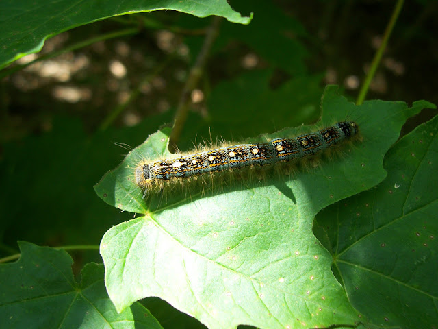
I noticed this little fellow on a leaf at my parents' cottage. The peonies in my mother's garden are bursting open with a riot of pink intensity and incredible fragrance.
The screen door of the porch at my parents' cottage has a whimsical motif in each of its corners.

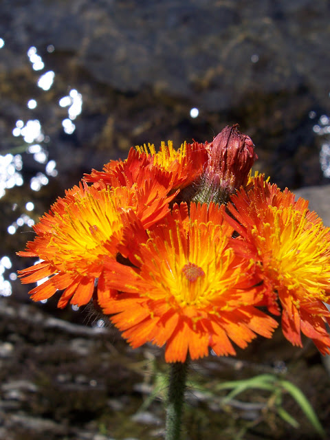
Wildflowers abound at the cottage. This one had a beautiful, hot-orange that I couldn't resist. It was growing all by its lonesome at the water's edge.A more prolific array of wild flowers grows along one of the embankments next to the cottage.
Wild strawberries also grow on the property, though they are hidden under the tall grasses. They are not particularly sweet and have a somewhat sour taste to them.
I always like to take walks through the forests that surround the cottage, marveling at the quietude and all the lush greenery that grows so freely and naturally anywhere it can. I was enchanted by this fern growing on top of a large boulder that was covered in moss.
The lake at the cottage was so warm and beautiful. I loved how the sun danced across its little ripples and waves.

6.08.2010

Martha's New Shows at Hallmark

The fall lineup at Hallmark was announced today, including the spate of new Martha Stewart programming. Following new episodes of "The Martha Stewart Show," to air weekdays at 10 a.m., will be an as-yet-untitled hour-long talk show with Stewart's daughter, Alexis Stewart, and pal Jennifer Koppelman Hutt, hosts of Sirius XM's "Whatever." The show will be filmed before a studio audience and tackle the day's headlines, as well as fashion, beauty and more. "I see it being like 'The View,'" said Laura Sillars, senior vice president of lifestyle programming at Hallmark. "They're going to have fun with it, be witty and humorous, but still give information. We're looking forward to that one because I think it'll bring in a younger viewership."
Mad Hungry With Lucinda will debut at noon, with Martha Stewart Living Omnimedia executive food editor Lucinda Scala Quinn. Quinn is an author of several popular cookbooks, including "Mad Hungry: Feeding Men & Boys," which is the inspiration for the series.

"I feel good about being with Hallmark because I'm all about the family meal and Hallmark is all about family programming," said Quinn. "This is really just a sort of how-to uprising for bringing back the family meal in an affordable, accessible, fun way - in real time, with a real-life action plan to feed the people you love."

Following a half-hour of "Mad Hungry," Hallmark will air an episode of Stewart's "Everyday Food" (from seasons one through four) from 12:30 to 1 p.m. From 1 to 4, the network will air select episodes from MSLO's library, including titles like "From Martha's Kitchen" and "From Martha's Home." Martha will also tape original Halloween and Christmas specials, as well as conduct two prime-time interviews for the network this fall.

"Daytime television is still a viable way that women learn better ways to do things in their lives," said Sillars. "It's still a very important part of our culture and the way we watch television."

6.07.2010

Hand-Hooked Skylands Rug

I received a beautiful email recently from a textile artist named Micheline Mann, who creates stunning hand-hooked rugs from her home and studio in Paisley, Ontario. She had come upon my blog and wanted to share images of this rug she hand-hooked for Martha for her home in Maine. The inscription reads "Skylands 1925" (the year the home was built) and featured prominently in the imagery is a pair of ring-necked pheasants, which are native to Mount Desert Island.

Micheline sent the rug to Martha and not long after she received a personal call from Martha's assistant thanking her for the rug and letting her know how much Martha loves it. I wouldn't be surprised if this rug is now somewhere in that sprawling hilltop estate.


A photo of the work in progress.
That's the completed rug, above. So much detail! To see more of Micheline's beautiful rug work visit her website at mannmadestudios.com.

6.02.2010

Evolution of the Splash Page

In many lifestyle and fashion magazines, the core features are located in an advertisement-free zone towards the end of the issue, rather like the feature film following the previews. In the publishing industry this zone is referred to as 'the well.' Few magazines handle the well more beautifully than Martha Stewart Living, both in terms of its stylistic presentation and in terms of its theme.

To introduce the well, the editors at Martha Stewart Living have have always provided readers with an enticing splash page, a sort of photographic invitation to explore the features that lie beyond. It is a gateway, a quiet beckoning to come inside (or go outside!) and linger for a little while.

Below I've selected some summery splash pages from past issues of Martha Stewart Living to demonstrate the evolutionary motifs the editors have employed to get us readers all set to dive into this welcoming well!
From the beginning, Martha Stewart Living has introduced its well with a splash page. The early pages included a photograph - a lifestyle moment - with a reflective, almost poetic paragraph of prose to further expand on the feeling of the month or season in question. This image, above, is from the summer 1994 issue of the magazine. The paragraph reads: "Our needs are simple now. A couple of chairs. A large, sturdy tree. A patch of sunlight dappling the shade. This is the season when life moves outdoors and everything seems easy. Friendships deepen over casual dinners. The coals on the grill go cold, but the conversation lasts well into the evening. By fall, we'll have it all figured out." The MSL splash pages maintained this style of presentation throughout the 1990s.
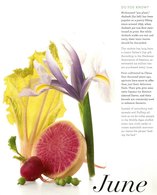
By 2003, the editors had decided to shake things up a bit. Throughout 2003 and 2004, the splash page became a more informative addition. The popular "Do You Know?" column had moved from the front of the magazine to the splash page itself, featuring interesting facts about the month or season in question. To offset the factual element, a creative tableau of the season's best offerings was arranged.
In 2005, the editors had yet another approach: a seasonal representation against an all-white background with the word of the month somehow incorporated into the scene. For this August, 2005, issue the editors had a sand castle built and used small flags to announce the month on each of its spires and turrets. Another example was calligraphy on an invitation, or embroidery on a linen napkin.
For their 15th anniversary year, the editors looked back to locate some of their favourite imagery from the magazine. Each month, an editor would select his or her favourite image for the splash page and explain why it was chosen. For the June issue, collecting editor Fritz Karch chose this image of an assistant food editor with an apron full of berries picked from the grounds of Martha's home in East Hampton, Lily Pond Lane.
In 2008, it was pared-down simplicity. One word was chosen for each month by the editorial team and then a photographer would interpret that word. In this case, "Breezy" was beautifully represented in a photograph by Katherine Wolkoff.
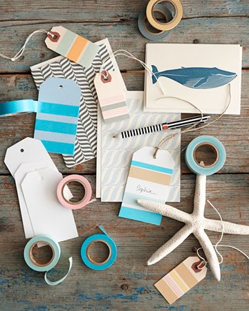
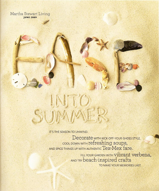
In 2009, we see a blend of almost all former elements: a thematic representation of the season (shells and sand) but mixed with text. In this case, it is a list of things to do, a table of contents of what can be found in the pages beyond.
Back to simplicity and fun this year! The editors had special wine labels made to spell the word "Living." Set artfully on a table, the suggestion is that of a free-spirited but elegant party. The white space used in the image provides scale in the most ingenious way. Does anyone have a favourite splash page from years past?